JavaScript is a universal language now. Its popularity, usage and its capabilities will keep increasing day by day. The future of especially web application development is in the hands of JavaScript and its various libraries and frameworks.
With node.js, JavaScript has also captured the niche server side as well in storm. In distant future, just by knowing JavaScript you would be bale to code an entire web application, both server and client side with ease.
This post, i cannot call as a very good blog post, but i just wanted to share the list of JavaScript database libraries i just searched using Google. Some of them might not be that useful a library as of now but can go on become more mature down the line.
The below lists some of the JavaScript database library:
These sites lists most of the JavaScript libraries which exists around the world written by awesome people.
Now the big question, which one should i use or standardize as the best one to develop a medium web application?
I don’t know, if anyone can help me, please drop me a comment and i will try to collate it and put another post, which would be more relevant and meaningful a post fr others.
Disclaimer: The content in this blog is plagiarized from various sites and blogs and is considered as a place where all their views are consolidated and put into a view which can be used as a guideline for any web application development. All the articles from which this blog is based is given below in the “Reference” section. Thanks for all the great authors and their work. Truly Appreciate!
Introduction
This document aims at providing a basic guideline using which UI/UX team can develop the web application story board. Mobile optimized web application is gaining traction and it’s time for any web application being developed to consider mobile devices. On a high level mobile optimized sites can be built using the below:
Responsive Web Design (RWD) – The document does give more insights and details on this design as this most talked design consideration in regards to web application.
Having different set of HTML and CSS catering to desktop and mobile device served by detecting the user agent and a single URL. Not considered to be a real way forward because of alternates (RWD).
Two set of URL for desktop and mobile and is decided agent sniffing the user agent. Again, not considered as a choice because of alternates available and cons attached to it is high as opposed to pros.
Design Principles
Some of the design principle which needs to be kept in mind is:
Responsive Web Design
Mobile-first design
Progressive enhancement and gracefully degradation
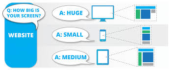
Responsive Web Design
Figure 1 Responsive Web Design
Ethan Marcotte coined the term responsive web design (RWD) in the year 2010. Responsive web design is a setup where the server always sends the same HTML code to all devices and CSS is used to alter the rendering of the page on the device using media queries. In essence responsive web applications respond to their environment. It’s considered as a cost effective way to mobile application. RWD is achieved using the following:
Fluid/flexible grid-based layout
Fluid images and media
Media queries and media query listeners
Having said that we can indeed have a mixed approach where we have a fixed width for large and medium screen widths and fluid widths for small ones. Whether small, medium or large, one site for every screen out there is the ultimate aim which RWD brings onto the table.
Why Use?
Day by day number of devices, platforms and browsers are increasing and your application should be able to support as much as possible without breaking and without compromising user experience.
A single URL for a piece of content makes it easier for your users to interact with, share, and link to your content
No redirection is needed for users to get to the device-optimized view, which reduces loading time. Also, user agent-based redirection is error-prone and can degrade your site’s user experience
When to use?
Time & Money
Browser support
Performance
Content
Website Vs. Web App
Frameworks
If you go for framework, it will definitely save time. Otherwise, we can go in-house, to have more control but we might be stuck where we are if there is no roadmap. There are good amount of frameworks, well tested and established which can be used:
Twitter Bootstrap
The Goldilocks Approach (http://goldilocksapproach.com/)
Foundation
Skeleton etc.
At an onset, Twitter Bootstrap is the most promising one and once we do a full on paper evaluation to arrive at a choice.
Mobile-first Design
Historically, most web designers and their clients have approached the desktop side of any project first, while leaving the mobile part as a secondary goal that gets accomplished later. There’s a growing trend in the industry though to flip this workflow on its head and actually begin with mobile considerations and then work up to a larger desktop version. Mobile-First Responsive Web Design is a combination of philosophies/strategies, and ultimately boils down to a broader application of good old web best practices. As the digital landscape gets increasingly complex, we need to design experiences that work across the entire spectrum of digital devices.Mobile First is a philosophy created by Luke Wroblewski and as detailed above highlights the need to prioritize the mobile context when creating user experiences.
Why?
Mobile isn’t a trend, nor is it even the future, it’s the present.
o Almost 25% of the Web’s traffic now comes from mobile. If you didn’t build a responsive site, you’re already losing a quarter of your users.
o Mobile device sales are increasing across the board with over 85 percent of new handsets able to access the mobile Web
o Mobile device sales are increasing across the board with over 85 percent of new handsets able to access the mobile Web
There are good amount of tools, technologies and framework available which will let you do this design principle easily.
Announcement from Eric Schmidt in 2010 that Google was going to be taking this approach from now on. No problem going behind great leaders in this space.
When to use?
All the points as discussed in RWD holds good. It does put some constraints and pressure on the developer but its worth in long run and above all good for business.
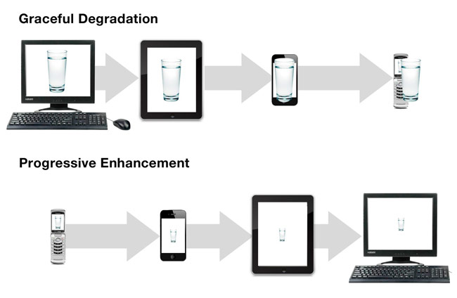
Progressive Enhancement and Graceful Degradation
Mobile-first responsive web design comes down to using Progressive Enhancement and Graceful Degradation as a foundation for web strategy and design. Designing with progressive enhancement involves smartly adding layers of enhancements to a strong foundation in order to deliver an accessible and optimized experience to all. Starting with mobile and designing with progressive enhancement covers all bases (even if just at a rudimentary level).
Figure 2 Progressive Enhancement and Graceful Degradation
Note: Don’t misunderstand visualizing the above figure as almost equal to the RWD figure. Not only will the form factor changes when being used across multiple devices, the capabilities of browsers rendering these pages also have different capabilities.
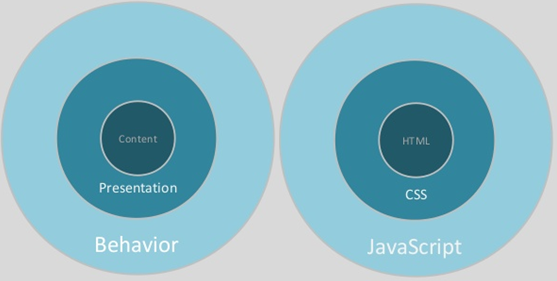
Figure 3 How an application should be conceived and designed to achieve this design principle
Figure 3 above depicts as to how to code your web application and what are the languages to be used and for achieving what. The content should be taken care using HTML (HTML 5), all styles and presentation around the content should be handled completely using the CSS (CSS 3) and behaviour should be achieved using JavaScript.
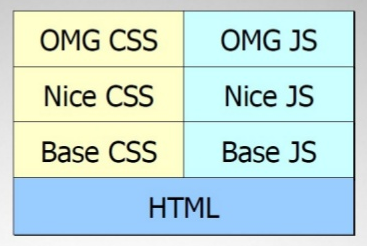
Figure 4 How the code should be structured to achieve this design principle
Figure 4 above explains Figure 3 in technical aspect clearly. You need to have a base HTML along with base CSS and JS which renders just fine in any browser (old ones). You need to have next set of nice CSS and JS which will adds more styles and behavior to the base one which works just fine in medium range browsers (IE 6, IE 8 etc.). You need to have awesome CSS and JS adding on top of base and nice CSS and JS, which will run just fine on all modern browsers (Chrome, Firefox etc.).
Why?
If this design principle is not given due respect, developer may limit the websites functionality considering it work fine in older browsers
Sites break when rendered with older browsers
Considerations
Use HTML 5 and CSS 3 and make sure that the code is W3C compliant
Consider above design principles in all aspects (guideline as to when each should be considered is detailed in the following section)
Use detection libraries like Modernizr (http://modernizr.com/) to eliminate or rather adapt your web application to various HTML5 and CSS 3 capabilities each browser supports.
Guidelines
Any web application being developed can be categorized broadly into different categories. One such category is:
Internet based (staff as well as external customer accessing web applications)
Intranet based (exclusive for staff)
Another way of categorizing a web application broadly is as below:
Web application having a definite mobile strategy
o Maintaining a mobile only site and based on the user agent detection call appropriate URL’s
o Having a native application specifically developed to cater to the mobile devices
Web application not having a definite mobile strategy
o Most of the intranet staff application fall into this category (this is something which has been done in the past but with the growing tendency of staff asking for application to be accessed using a mobile device is growing)
For internet based web application having a definite mobile strategy, making the web application align with these design principles should be looked upon on a case to case matter as there is a cost involved in making a web application align with these design principles. Since there is a mobile strategy already existing for this web application, users does have an alternate way of accessing the application wither using a dedicated mobile URL or using a native app. Having said that, both mobile web URL and native app does have some dependency on the device being used and ideally considering the cost, going with our design principles and considerations as detailed above is encouraged. For internet based web application not having a definite mobile strategy, the application should be built using all the design principles and considerations as detailed above. The reason being, the application can be used by users in different parts of the world using different devices and browsers and the application should be ready to support this diversity. For intranet based web application having a definite mobile strategy, to not overburden the budget the design principles can be compromised but considerations should be taken into account and implemented. Ideally, if the application is responsive in nature even the mobile strategy of either having a dedicated URL for mobile or a native app can be reconsidered and can be taken out of service and replaced with the responsive site. For intranet based web application not having a definite mobile strategy, according to the usage patterns (analytics gathered from existing application or forecast and prediction on usage of mobile devices) the decision on whether to go with design principles has to be made. But, the considerations have to be taken into consideration and implemented. Note: Optimizing for every web-enabled device on earth is impossible, so eventually you need to make the strategic decision of what target devices and browsers for which the web application needs to be optimized. This decision can be based on existing applications analytics per market research on target web applications user base.
Take-Away
Users care for content
Users use only one browser
Give incentives for users to upgrade to a modern browser
Support best possible experience (based on device and browser capabilities), not the same experience for all users
Do your presentation/styling using only CSS (CSS 3) rather than using tools or manual coding
Don’t try to make older browsers to do things they are never meant to do. If you do, you will have long development time, too many bugs and it will perform badly (slow pages).
Set of Html’s and CSS (the URL remaining the same) catering to whether the user agent is desktop or a mobile device seems too much maintenance havoc and should be avoided and replaced with RWD.
While reading any article i like to mark important and catchy phrases, which i can skim through at a later point. This article is in no way belong to me. It was written by “John Sullivan”, the detail of author and the original article URL is given below. As described, i just went through the whole article, found it awesome, marked important points while i read and thought of sharing it in here so that, people who would like to just skim through the matter quickly an do so by just go through the article highlights. I don’t know if this is a good practice nor i don’t know whether it is legal. If this is not legal, please update a comment and i will do the needful.
The original article is highlighted and saved as an image. Please click the image, zoom to read it clearly.
Dr John Sullivan is an internationally known HR thought-leader from the Silicon Valley who specializes in providing bold and high business impact; strategic Talent Management solutions to large corporations. He’s a prolific author with over 900 articles and 10 books covering all areas of Talent Management. He has written over a dozen white papers, conducted over 50 webinars, dozens of workshops and he has been featured in over 35 videos. He is an engaging corporate speaker who has excited audiences at over 300 corporations / organizations in 30 countries on all 6 continents. His ideas have appeared in every major business source including the Wall Street Journal, Fortune, BusinessWeek, Fast Company, CFO, Inc., NY Times, SmartMoney, USA Today, HBR and the Financial Times. He has been interviewed on CNN and the CBS and ABC nightly news, NPR, as well many local TV and radio outlets. Fast Company called him the “Michael Jordan of Hiring”, Staffing.org called him “the father of HR metrics” and SHRM called him “One of the industries most respected strategists”. He was selected among HR’s “Top 10 Leading Thinkers” and he was ranked #8 among the top 25 online influencers in Talent Management. He served as the Chief Talent Officer of Agilent Technologies, the HP spinoff with 43,000 employees and he was the CEO of the Business Development Center, a minority business consulting firm in Bakersfield, California. He is currently a Professor of Management at San Francisco State (1982 – present). His articles can be found all over the Internet and on his popular website www.drjohnsullivan.com and on www.ERE.Net. He lives in Pacifica, California.
In the world of hardware and networking you would have heard this term being used often. When two networking gurus meet these terms comes in between and to be honest I didn’t know what this is. I just Googled as always and here are the relevant patches that I found which can be collated as below:
Abbreviated as VIPA, a virtual IP address is an IP address that is shared among multiple domain names or multiple servers. A virtual IP address eliminates a host’s dependency upon individualnetwork interfaces. Incoming packets are sent to the system’s VIPA address, but all packets travel through the real network interfaces.
A virtual IP address (VIP or VIPA) is an IP address assigned to multiple applications residing on a single server, multiple domain names, or multiple servers, rather than being assigned to a specific single server or network interface card (NIC). Incoming data packets are sent to the VIP address which are routed to actual network interfaces.
VIPs are mostly used to consolidate resources through the allocation of one network interface per hosted application.
There are many uses of VIP, but for me the one which is more important is how using a domain name the routing happens correctly to the exact web application in a web server in which there are multiple web applications being hosted. Figures are easy to understand and below is one such figure which made me understand this concept which I got in the internet.
Summary: Add support so programs can operate on an arbitrary block of code with parameters, and simplify the use of methods that receive such blocks.
This JSR provides support for operating on an arbitrary “block of Java code”, or body, which is either a statement list, an expression, or a combination of both. We call the mechanism a closure expression. Wrapping statements or an expression in a closure expression does not change their meaning, but merely defers their execution. Evaluating a closure expression produces a closure object. The closure object can later be invoked, which results in execution of the body, yielding the value of the expression (if one was present) to the invoker. A closure expression can have parameters, which act as variables whose scope is the body. In this case the invoker of the closure object must provide compatible arguments, which become the values for the parameters.
In addition, this JSR may support a new invocation statement for methods that accept a closure to simplify their use in common cases.
Since Java 1.1, anonymous inner class have provided this facility in a highly verbose manner. They also have a restriction of only being able to use final (and definitely assigned) local variables. (Note, even non-final local variables are in scope, but cannot be used.)
Java SE 8 is intended to have a more concise version of this for single-method interfaces*, called “lambdas”. Lambdas have much the same restrictions as anonymous inner classes, although some details vary randomly.
*Originally the design was more flexible allowing Single Abstract Methods (SAM) types. Unfortunately the new design is less flexible, but does attempt to justify allowing implementation within interfaces.
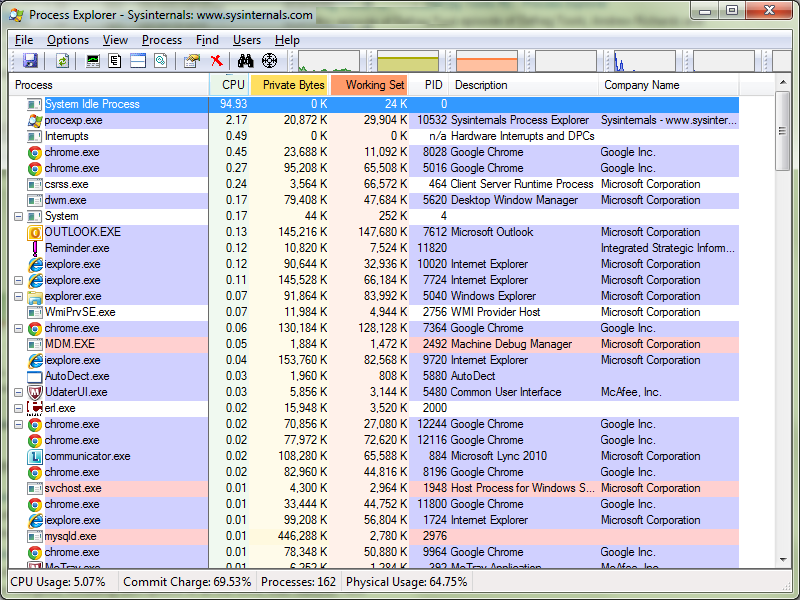
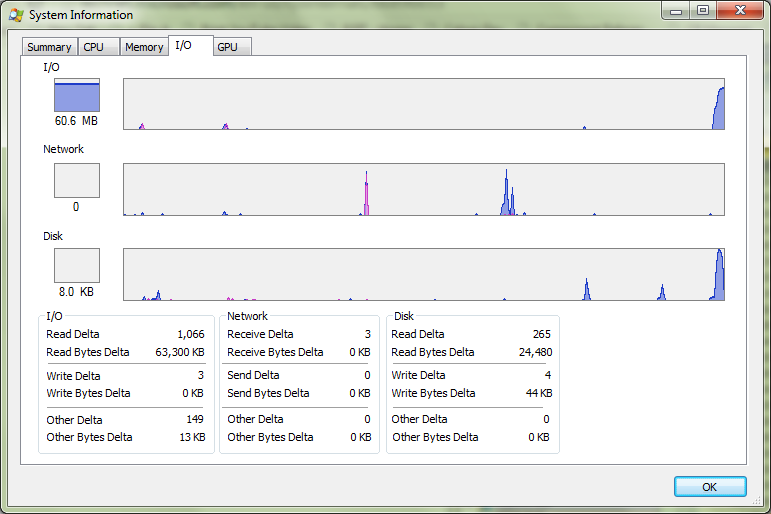
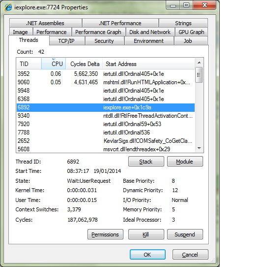
Have you felt at any point that Windows “Task Manager” is limiting in functionality? If so, this blog will try to give a solution by which you will have much better details on various programs running on your Windows machine with lots of data at your finger tips.
By the way I haven’t done anything in this blog by myself, rather I would just point to a simple utility which will help you get these details… :).
The tool we will be using is Windows Sysinternals Process Explorer. It is provided as a free download from Microsoft.
You will need to download and unzip the Process Explorer package. The application does not have an installer, so unzip it somewhere convenient so that you can launch it when needed.
Complete details on the features of this simple program is detailed in the URL above.
Some screenshots which will make you use this enhanced Task Manager in Windows.
Recently I saw in a program in Television in which there was new technology developed by Japanese to destruct a building in a phased manner without noise, smell or dust in the middle of a crowded city.
The news article can be found here. For readers I am pasting the main content from this site for easy reading.
Grand Price Hotel Akasaka Japan
The Grand Prince Hotel in Akasaka which was built in the 1980s, previously stood tall at 460 feet until the Taisei Corporation demolished the building from the inside on a floor by floor basis, reportedly losing two floors every 10 days. The innovative Taisei Ecological Reproduction System (TECOREP) is a potentially efficient approach to deconstruction in densely built cities, also designed to recycle the energy pent up in a tall building. The top floor was reinforced by engineers with steel beams, and subsequently severed but kept in place to be used as an adjustable lid which could be lowered down on the building on an external support frame.
“In this demolition scheme, the building shrinks and disappears without you noticing,” said Hideki Ichihara, manager of the Taisei Corporation. “Dust pollution is cut by more than 90 percent, keeping the environmental impact very small.”
I watched the program and was amazed by it. Such a cool idea to destruct a structure as huge as this for me was awesome.
In the next few days I didn’t think of it and one fine day during an interacting session with my colleagues at office it was conceived that the current product on which we Software Engineers were working on needs uplift in technology and architectural aspects (overhauling). Since in Japan it was destruction which was done in a phased approach, I didn’t think there was any synergy that I could think of something like this in the case of a software application/product.
I then accidentally stepped on a recent article by Martin Fowler (Genius)in here. Suddenly I could see a co-relation or rather synergy between the Japanese way of building destruction with Martin Fowler’s way of uplifting/rejuvenating an existing software application/product.
I wouldn’t want to take any content out of his article and make my own article as no one in the world can write an article in such plain English as Martin. He explains this concept in such an easy manner that a lay man could easily get crux of what he wants to say.
There are some cool references in his article which also is a definite read.


